Línea Directa launches "tirí tirí tirí," a striking campaign based on its iconic sound logo to boost brand consideration
- Coinciding with the company's 30th anniversary, Línea Directa has developed a new advertising campaign titled "Tirí Tirí Tirí," which centers around the graphic and spoken representation of the company's iconic sound logo, one of the most recognized sound identities in Spain.
- With this transmedia campaign, the entity aims to boost brand consideration and highlight its multi-product offering, high service quality, competitive pricing, and leadership.
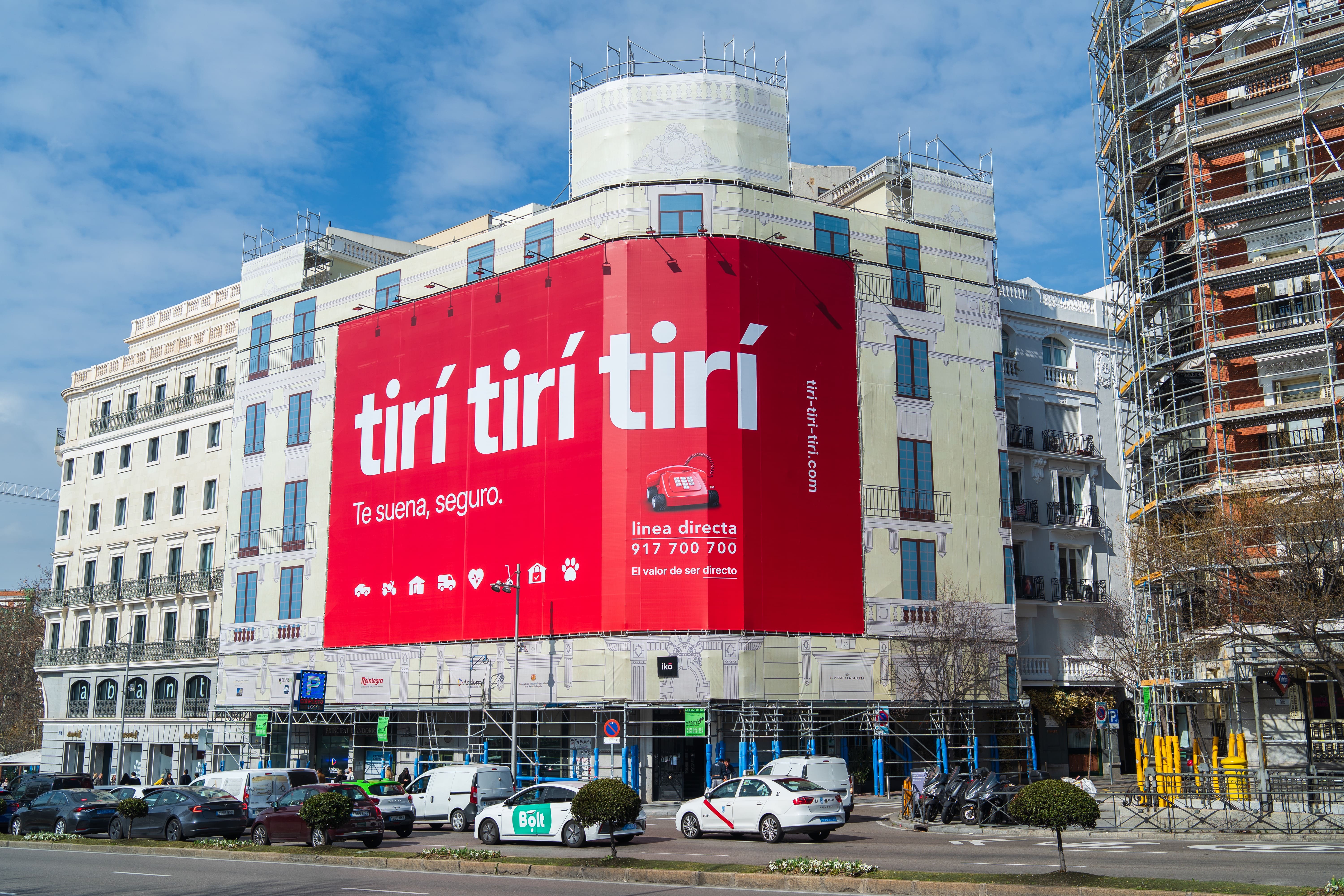
- The pre-launch took place on 14 February with the deployment of a large red banner in central Madrid that only included the message "Tirí Tirí Tirí. Does it ring a bell?" and subsequently with insertions in mass media (television, radio, and digital press). Today, Línea Directa has revealed that it was behind this action, initiating the second phase of the campaign, which will focus on the insurer's extensive catalog of insurance products.
- Línea Directa has also updated its emblematic logo, replacing it with a new simplified version, without the computer mouse, reflecting the recognition and leadership achieved since its creation.
Madrid, 19 February 2025.- Línea Directa Aseguradora, one of the leading insurance companies in the country, has consolidated its brand, Línea Directa, as one of the most notable in the Spanish insurance market. This has been contributed by the high recall among the public of its red telephone logo, as well as its recognizable sound logo. Leveraging this iconicity and coinciding with its 30th anniversary, the company has launched a new advertising campaign called "Tirí Tirí Tirí," which centers around the graphic and spoken representation of its sound identity, one of the most recognized in Spain.
The objective of this transmedia campaign, with presence in outdoor, television, radio, and social media, and in which Línea Directa has collaborated with PS21, the new creative agency the company has been working with since last December, is to boost brand consideration by leveraging the positioning achieved by Línea Directa's sound logo in the collective imagination. Additionally, the insurer seeks to reinforce awareness of its multi-product offering, high service quality, competitive pricing, and leadership.
To this end, the company deployed a large red banner on 14 February on a building near Puerta de Alcalá in Madrid with only the message "Tirí Tirí Tirí. Does it ring a bell?". This teaser action, which precisely appeals to public recall, was aimed at attracting attention and generating expectation and conversation, thus involving the viewer. It also had its deployment in mass media (radio, television, and digital media) and involved several influencers and content creators who participated in the teaser launch, generating a significant wave of conversation in the social media environment, especially Instagram and TikTok.
Today, Línea Directa has revealed that it was behind this pre-launch by adding the logo and the company's name to both the banner and the television and radio ads and the rest of the campaign content on digital channels.
Starting 19 February, the campaign message evolves to "Tirí Tirí Tirí. It surely rings a bell. What might not ring a bell is everything we insure" and its various iterations. With this, the company will highlight its extensive catalog of insurance for individuals, freelancers, and SMEs, currently consisting of car, motorcycle, professional vehicle, home, health (for individuals and groups), pet, personal mobility vehicle, and home occupation protection policies.
New logo: simplicity and recognition
Coinciding with the launch of the new campaign and the commemoration of the company's 30th anniversary in 2025, Línea Directa Aseguradora has updated its iconic logo, presenting a new version that opts for simplicity and balance.
The new emblem of Línea Directa maintains the red telephone as the central element and the brand name with the same typography as before, and dispenses with the computer mouse, added in 2006 to evoke the entity's digital dimension, now implicit in the brand itself. Through this evolution, the Group reflects the recognition achieved over the years, in which the red telephone has transcended the object it represents and has consolidated as the element that represents the brand, its business model, its leadership, and its values.
In the words of Antonio Valor, Marketing Director of Línea Directa Aseguradora, "we are starting a new communication stage in which we want to boost the consideration of both our leading brand, which for Línea Directa is a strategic asset due to its enormous iconicity and the high recognition it has achieved for quality, price, and leadership, and our value proposition, with which we want to be the reference insurer for individuals, freelancers, and SMEs."